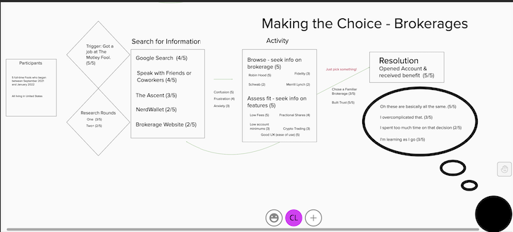
Brokerage User Journey
When was the last time you selected a brokerage account? How did you feel during the process? Overwhelmed? Exhausted? As an in-house researcher for a financial media company, I explored user sentiments when selecting a brokerage account for their personal finances.
Guiding Questions
What are the deciding factors that push users to select one brokerage over another?
What are the greatest points of frustration for users when searching for a brokerage account?
What resources do users access to make their final decision?
The Process
Identify Research Methods.
In order to identify the the main behaviors and frustrations of users, the best course of action was conducting user interviews of individuals who had recently (within 3 months) made this decision.
Draft the Script.
Keeping the guiding questions in mind, I drafted a script to follow when interviewing users. These questions would help uncover key behaviors, resources, decisions, and emotions of the users during the process of selecting a brokerage.
Recruit Users.
To recruit users for this research, we pulled from the existing membership pool of the Fool. This was the most effective way to reach: an audience that:
had recent experience choosing a brokerage
lives within the United Kingdom.
Conduct interviews.
Once users were selected for interviews, the data collection began. This included recorded interviews with users demonstrating their process when selecting a brokerage. Questions targeted the following categories:
Triggers for their search
Key features that drove their decisions
Resources used (articles, reviews, recommendations, etc.)
Challenges
Build the journey map.
Distilling all of the qualitative and quantitative insights into a single journey map, we bucketed insights into the following key categories:
The trigger for their search
Information-gathering using third parties
information gathering on the websites that host the brokerages
Opening an account
Share insights.
The key takeaways that we shared with the internal design team included:
Individuals expressed how difficult it is to make a decision with so many features to consider. So design should create a comparison tool to enable users to easily select and compare brokerages based on a number of features.
Limit current table listings to 5-7 items. Any more, and the users felt overwhelmed and ignored the information.
Users felt confident after making their decisions. There is a content and SEO opportunity here to ease the decision-making process in the future.

